
Emphasis in art is what makes one part of a picture more special than the rest. When an artist uses emphasis in art, they guide your eyes to the most important spot. It helps you notice what truly matters in the artwork. Without emphasis, a painting or drawing can look flat and confusing. Artists use things like color, size, shape, and light to make certain parts stand out. This makes the artwork more interesting and gives it a story to tell. Emphasis in art is not just about making something brighter or bigger; it’s about helping people understand the meaning behind the art.
Emphasis in art also helps show feelings and ideas. For example, if an artist wants to show peace, they might use soft colors and smooth lines to draw attention to a calm area. But if they want to show power or drama, they might make one object dark, bold, or large. This focus helps people feel what the artist wants them to feel. Emphasis makes art powerful and clear. It teaches us that small details can change how we see the whole picture. Learning to use emphasis in art can help anyone—beginner or pro—make their work more beautiful and meaningful.
What Is Emphasis in Art
Emphasis in art is the way artists draw attention to one main part of their artwork. It helps guide the viewer’s eyes to what matters most in the picture. Imagine looking at a painting where everything looks the same—you wouldn’t know what the artist wants you to see first. That’s why emphasis in art is so important. It helps tell the story behind the artwork. Artists can use different tools like color, size, texture, and light to create emphasis. By doing this, they make certain parts stand out while others stay quiet in the background.
Emphasis in art is like using a highlighter on a page. It points to the most important idea. Without it, an artwork can feel lost or confusing. Every artist—from beginners to professionals—uses emphasis in their own way. It’s not about making something look loud; it’s about showing meaning. When used right, emphasis makes people stop and look longer. It helps the artwork speak without words.
Why Emphasis in Art Matters

Emphasis in art matters because it helps the viewer understand the message of the artwork. Every painting, drawing, or sculpture has a story. Without emphasis, that story may get lost. When an artist uses emphasis well, it’s easier for the viewer to connect with the art. The main subject becomes clear, and the artwork feels more alive. For example, in a portrait, the artist may use light to make the face stand out more than the background. That shows the viewer where to look first.
Art is all about emotions and ideas. Emphasis helps artists express those feelings better. It also adds excitement and movement to the work. When you look at a painting with good emphasis, your eyes naturally move around the picture but always come back to the main point. That balance keeps the viewer interested. So, emphasis in art is not just about beauty—it’s about communication.
How Artists Use Color and Light for Emphasis in Art
Color and light are two of the most powerful tools for creating emphasis in art. Bright colors grab attention quickly, while darker or dull colors make other areas fade away. Artists often use warm colors like red, yellow, or orange to bring focus to the main subject. Cool colors like blue or green are usually used for the background to keep things calm.
Light also plays a big role. Artists can use light and shadows to make one area pop out. For example, in many old paintings, the artist would shine light on the person’s face and leave the rest in shadow. This technique, known as chiaroscuro, makes the subject look more dramatic. Even in modern digital art, creators use lighting effects to guide the viewer’s eyes. So, both color and light work together to make emphasis clear and strong.
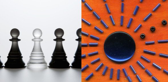
Different Types of Emphasis in Art
There are many types of emphasis in art, and each creates a different feeling. The first type is contrast emphasis, where opposite elements like light and dark or big and small are used. This type is easy to notice and very effective. The second type is isolation emphasis, where one object stands alone to get attention. For example, a single red apple on a white table instantly draws the eye.
Another type is placement emphasis, which is about where things are put in the artwork. The center of the canvas often gets more attention, so artists may place their main subject there. There’s also detail emphasis, where the artist adds more texture or fine details to a specific area. That makes it stand out compared to simpler parts around it. Each type of emphasis helps tell a different story and gives the artwork its own energy.
How to Create Emphasis in Your Own Artwork
Creating emphasis in art is easier than it seems once you understand the basics. The first step is to choose your main subject. What do you want people to notice first? Once you decide, you can use design tools like color, shape, and texture to make that area special. Try using brighter colors for your focal point or sharper lines that attract the eye.
Another trick is to reduce distractions. Keep the background soft and simple so the focus remains strong. Using contrast helps too—putting light against dark or smooth against rough can make a big difference. You can also use placement by putting your main object near the center or slightly off-center to keep it interesting. Remember, good emphasis does not mean making everything bold. It’s about balance and clarity.
Emphasis in Art Examples from Famous Paintings
Many famous artists have used emphasis in art to make their work unforgettable. In Leonardo da Vinci’s Mona Lisa, the soft light and calm colors around her face bring attention to her smile and eyes. That’s where the story lives. In Vincent van Gogh’s Starry Night, the swirling sky and bright stars pull your attention right to the movement and feeling of the painting.
Another great example is Edvard Munch’s The Scream. The main figure stands out sharply against the orange sky and bridge, creating strong emotional emphasis. Even modern artists like Pablo Picasso used emphasis through bold shapes and unusual colors to highlight certain ideas or feelings. These artists show that emphasis can look different in every style but still serves the same purpose: to make people notice and feel something special.
Common Mistakes When Using Emphasis in Art
One big mistake artists make is using too much emphasis everywhere. When every part of an artwork stands out, nothing truly stands out. It can make the picture look messy or confusing. Another mistake is ignoring the background completely. While the focus is important, the rest of the artwork still needs harmony and balance. Without that, the main subject might not feel natural.
Some artists also overuse bright colors or strong contrast. That can hurt the eyes or distract from the meaning. It’s better to keep things balanced and calm. Also, avoid making the focal point too small or too hidden. The viewer shouldn’t have to search for it. The best way to avoid these mistakes is to plan before you start. Sketch where the focus will be and test how light and color will work together.
Tips to Improve Balance and Emphasis in Art
To make your emphasis in art look better, focus on keeping balance. Start by checking where your eyes move when you look at the artwork. If they go to the main point first, you’ve done it right. Try to use just one or two strong areas of emphasis. Too many can break the harmony.
Use contrast wisely. Play with big and small, dark and light, or rough and smooth. Also, make sure the background supports the main subject instead of fighting with it. Sometimes less is more—simple designs can show emphasis more clearly than crowded ones. Practice often by looking at famous artworks and seeing how the artist used emphasis. With time, you’ll train your eyes to see what works best.
The Role of Contrast and Focus in Emphasis in Art
Contrast and focus are key to making emphasis work in any type of art. Contrast helps make one thing stand out by making it different from what’s around it. Focus directs the viewer’s attention exactly where the artist wants it. When both work together, they create a strong visual message.
For example, a dark object on a light background instantly grabs attention. The same happens when something sharp is placed beside something soft. Focus can also be made by blurring or simplifying other areas so the eye moves toward the clear and detailed part. Digital artists often use blur tools to do this. Traditional painters might use softer brush strokes for the background. No matter what method you choose, the idea is the same—guide the viewer’s eyes to the heart of your art.
How Emphasis in Art Affects Emotion
Emphasis in art is not just about looks—it also touches emotions. A bright spot in a dark painting might show hope. A large bold figure might show strength or fear. Artists use emphasis to make people feel what they want them to feel. When the eye is guided to one place, the heart follows.
Colors, light, and shapes all carry feelings. Warm colors can make a scene feel alive or happy. Cool colors can make it feel calm or sad. Sharp lines can feel strong, while soft ones feel gentle. When emphasis is used with emotion in mind, the artwork becomes powerful and memorable. It connects with people deeply and makes them remember it long after they’ve seen it.
Using Emphasis in Modern and Digital Art
In modern and digital art, emphasis is still a key design rule. Digital artists use software tools to control brightness, contrast, and placement to build focus. Websites, posters, and even game designs use emphasis to catch attention fast. For example, designers use bold text or bright buttons to show what’s important.
Modern painters and illustrators experiment with new ways to create emphasis too. Some use minimal colors, while others use strong geometric shapes. Even though styles change, the idea stays the same—help the viewer see and feel the main story first. Whether it’s a digital illustration or a sculpture, emphasis keeps art interesting and meaningful.
Conclusion
Emphasis in art is one of the most powerful elements that makes an artwork speak to its audience. It helps guide the viewer’s eyes, tells a clear story, and brings emotion to life. Without it, art can feel flat or confusing. Every artist, no matter their skill level, can learn to use emphasis to make their work more beautiful and meaningful. By mastering color, light, placement, and contrast, you can bring true focus and feeling to your creations.
FAQs
What does emphasis in art mean?
Emphasis in art means drawing attention to one main part of an artwork so it stands out from the rest.
Why is emphasis important in art?
It helps guide the viewer’s eyes and makes the message or story of the artwork clear.
How can artists create emphasis?
Artists use tools like color, size, contrast, light, and placement to create emphasis.
